
Jumbo
No-money loss gaming app


Role
Founding Product Designer
sole designer for the first stretch
Team
1 frontend · 1 backend
no PM
Timeline
2023
~6 months to 100K
Scope
0→1 product, UX, UI,
visual system, research
oVERVIEW
Wait, what's Jumbo Play?
🤔
It's a Gaming App where you can't lose your money.
Here you top up your wallet - say ₹100. You play with it.
Win, and your winnings stack on top and can go to your bank. Don't win, and the ₹100 is still sitting there - and you spend it on something real. A mobile recharge. A kettle. A pair of shoes from Jumbo Mall.
THE BACKSTORY
Where I came in
When I joined in Sept’23, the concept existed - but almost everything around it was still undefined.
No PM. No design team. No design system. Just a skeleton of an idea and a small team trying to figure out whether it could become something people would actually use.
Basically I wasn't joining to redesign something that already existed. I was joining at the very beginning, when almost every product decision was still up for debate.
We didn't have all the answers ↓
What should the experience feel like?
How should gaming, rewards, wallet and shopping come together?
Why would someone trust us with their money?
What would make someone play their first game?
So we started doing what a 0→1 team does best:
Build something → Put it in front of people → Learn → Change it → Build again
THE USERS
Who would actually trust us?
👀
The product involved money, gaming and an unfamiliar brand. Before thinking about perfect UI, we needed to understand the people we were building for.
01
Delivery agents & blue-collar workers
Our earliest users were largely delivery agents and blue-collar workers who were already comfortable putting small amounts into gaming apps & less had less risk factor.
02
Then prove the doubters wrong.
We wanted to understand what would make someone hesitant about gaming consider trying Jumbo Play.
When we were unsure, we didn't debate it for weeks. We went outside.
User validation
So we went and asked them
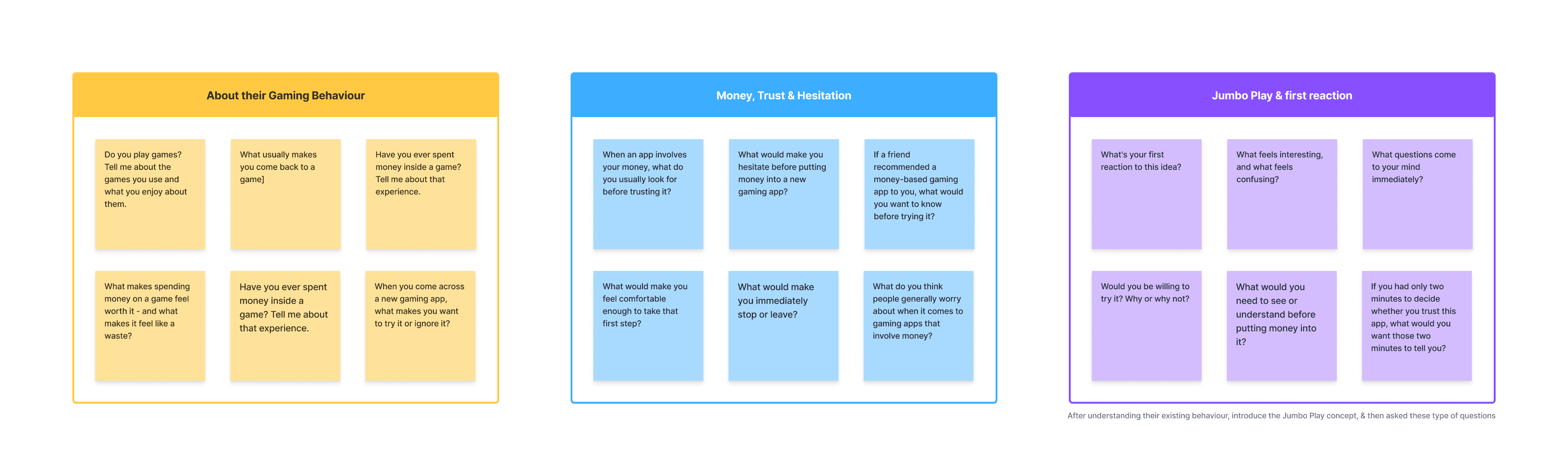
We regularly went to crowded markets in South Delhi, spoke to the people already comfortable(mostly blue collar workers) with gaming apps, and people who were hesitant to enter the category.
During these interactions, we asked questions like:
Insights
Interesting things we learned
🧐
After speaking with users across both groups, a few patterns started coming up again and again. These were the most common insights we took away from those conversations.
People didn't trust a gaming apps because of an ad.
Our early users almost always discovered & Trust these products through someone they knew - a friend, colleague or person around them.
The real barrier wasn't losing. It was trusting the app.
Users were less concerned about the possibility of losing and more concerned about whether their money was safe and the app was trustworthy.
Doubters would fund a wallet. They wouldn't fund a game.
Once the money was framed as staying useful - for gaming, shopping or recharge - the idea became easier to consider.
The “no-loss” idea made sense when users could see it.
Users understood the value better when they could see their money staying in the wallet and being useful for games, shopping, or recharge.
People leave when an app goes quiet - not when they lose.
Losing wasn't automatically the reason to stop. A lack of activity, rewards or something new to come back to was a stronger reason to disappear.
The first question was always: “What happens if I lose?”
Nobody asked us about the prize amount. The bigger question was whether the money they put in would still have value if the game didn't go their way.
The starting point
Taking the first design step
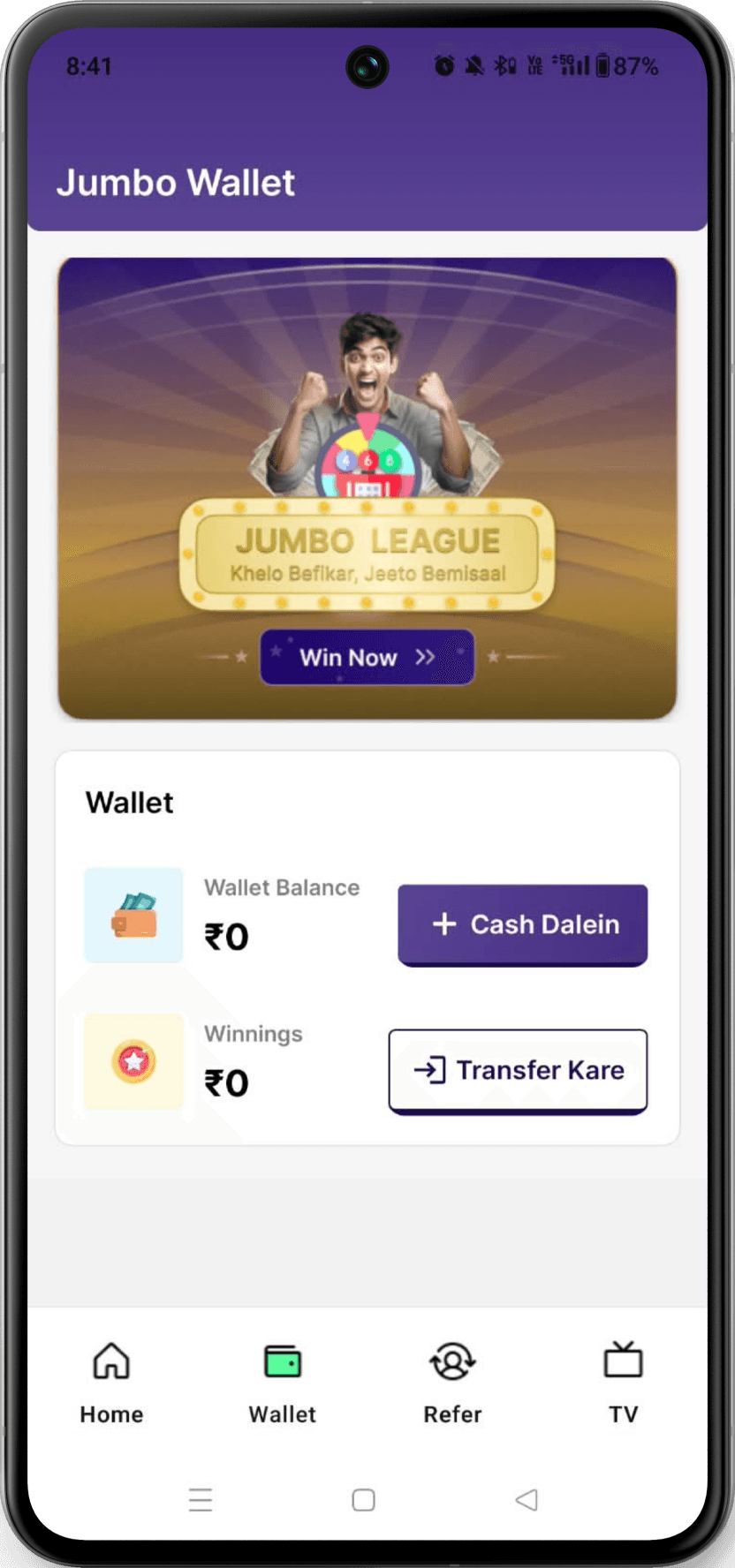
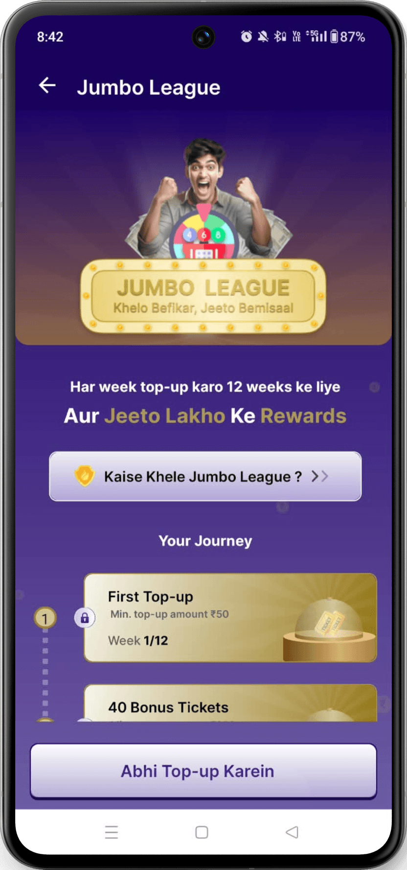
There was a working light-theme skeleton, product was functional, but the most important parts of Jumbo Play weren't visible enough.

Home Page
(Shopping List)

Product Detail Page
Wallet Page
(Game Entry)
Game Page
(Game Journey)

Wallet Top-up

Money Transfer

Reward History
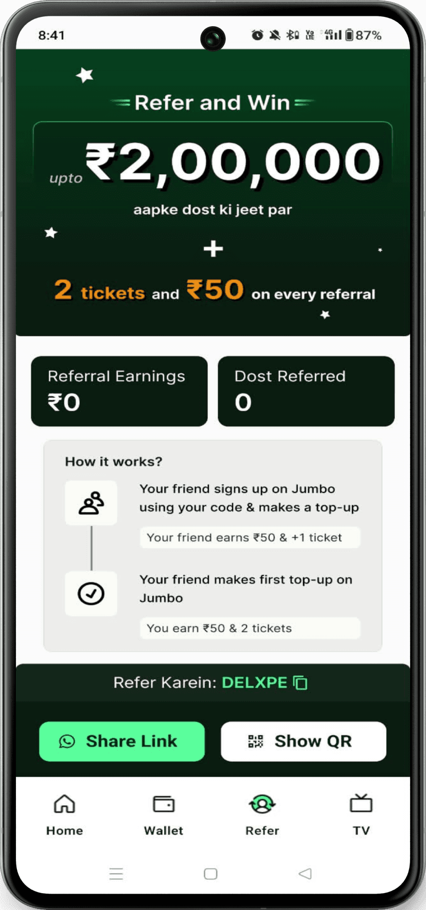
Referral Page

Game Live &
Leaderboard Page

Profile Page
Four things that were wrong
01
The first screen sold shopping, not Jumbo Play.
Users landed on products before understanding the game, the wallet, the rewards, or what made Jumbo different.
02
One game - pushed from everywhere.
Wallet, Refer, TV: every screen asked you to pick your numbers. The game had no home of its own, and there was nowhere to put a second one.
03
Nothing explained itself.
No labels, no help, no first-time hints. You couldn't tell what a screen was for, what a number meant, or what happened after you tapped.
04
The reassurance was there - but not where people needed it.
Security, wallet safety and the no-loss proposition needed to be understood before asking someone to take the first step.
The visual decision
Taking the first design step
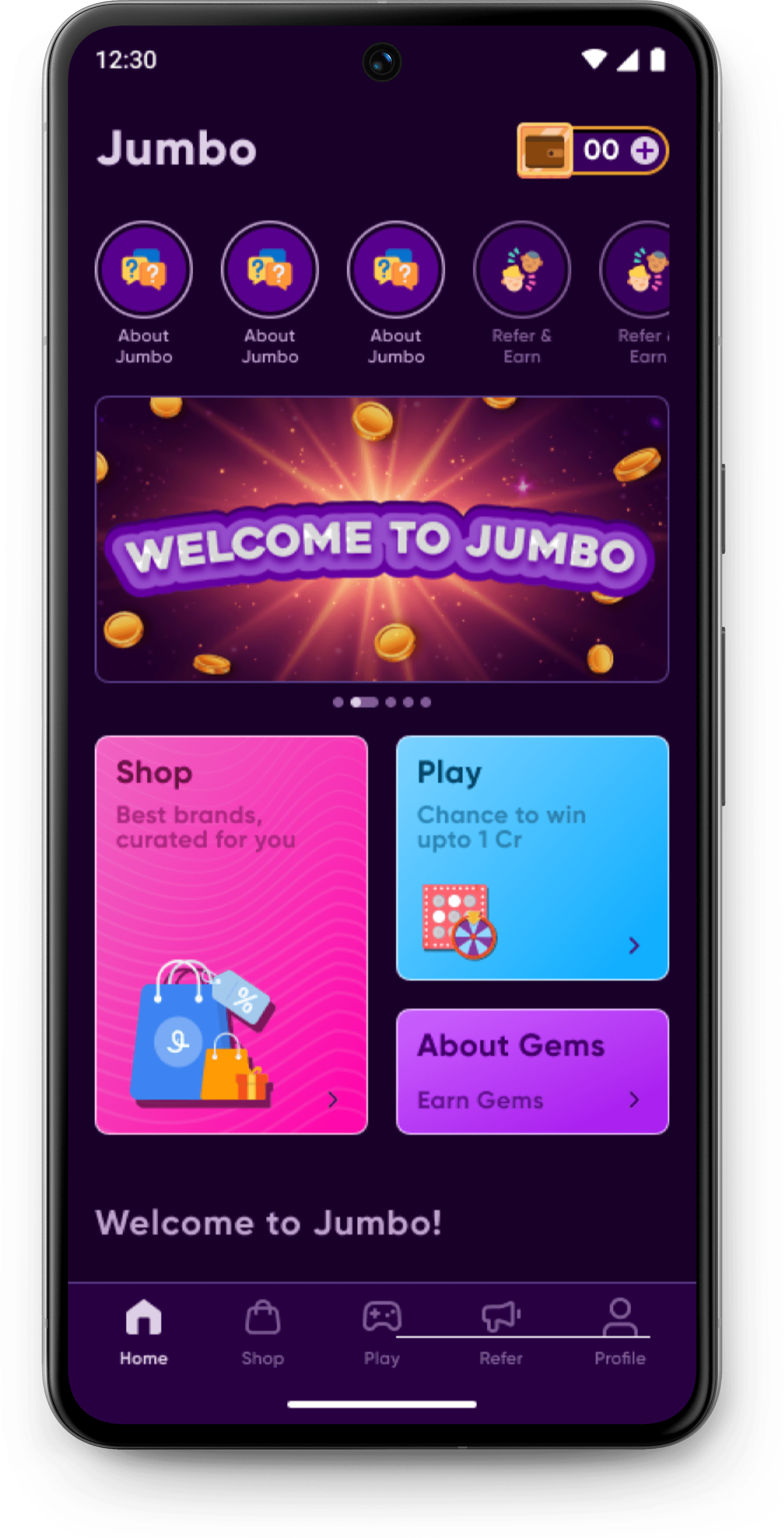
This wasn't simply a colour preference. The visual direction needed to support the product we were trying to build - gaming first, rewards second, shopping as the safety net.
01
It should feel immersive
A darker canvas creates a stronger gaming atmosphere and gives the experience a clear departure from a typical commerce app.
02
Rewards need to pop
Purple, gold and green could become meaningful signals for play, rewards, money and positive actions.
03
Keep the focus on action
A controlled dark base lets high-value moments — Play, Top-up, Rewards - carry the visual weight.
Button
Button
Button
Apply
Remove


+91
|
0000

120000
Home
Wallet
Jumbo TV
Mall
Refer & Earn


GOOD
LUCK



Jumbo live
Don’t miss the stream to know your reward
00 mins

100%
Safe & Secure

30K+
Trusted Users

Top
Brands
New Components
Thin
250
Ultra Light
250
Light
300
Regular
400
Medium
500
Semi Bold
600
Bold
700
Extra Bold
800
Black
900
Heavy
900
Gilroy

Onboarding Flow
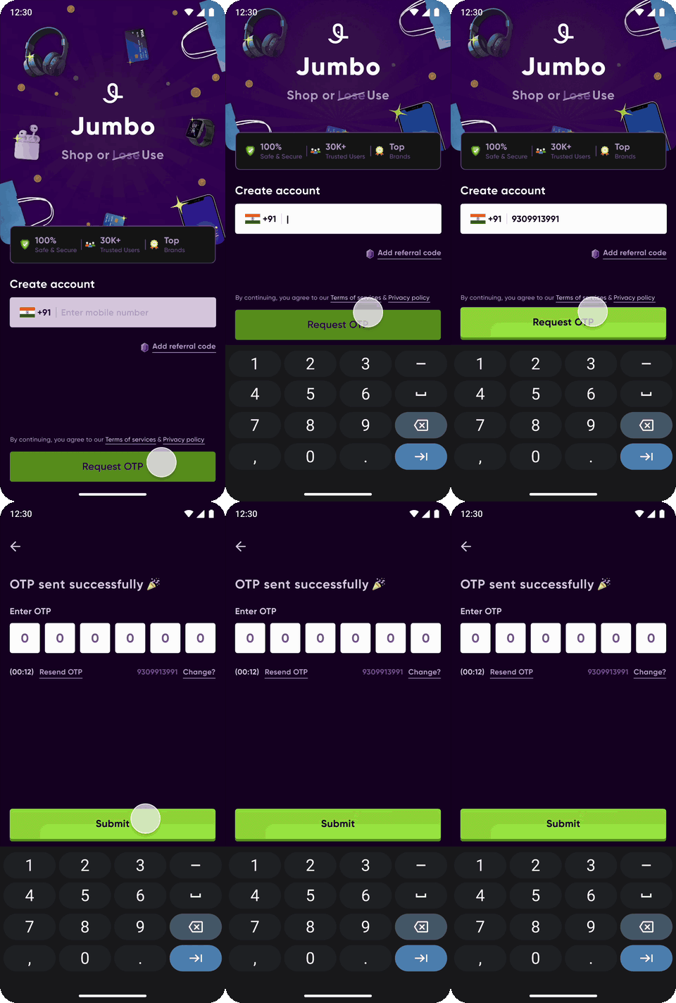
The old app opened on a shop. This one opens on an explanation - what Jumbo is, what happens to your money, and why it's safe - then asks you to log in.
Validates
"First question was always what happens if you lose." So that's the first thing the app says - before the login field, not after it.
Login Flow
The login screen wasn't just a form. I used it as the first opportunity to make Jumbo feel safe, credible, and familiar.
Trust signals: “100% Safe & Secure”, trusted users, and top brands address initial hesitation.
Minimal entry: Only a mobile number is required, keeping signup friction low.
Referral code: An optional path for users coming through someone they already trust.
Validates
"Before I put my number in, I want to know if this app is safe and trustworthy "
So I brought trust signals upfront - before asking users to sign up
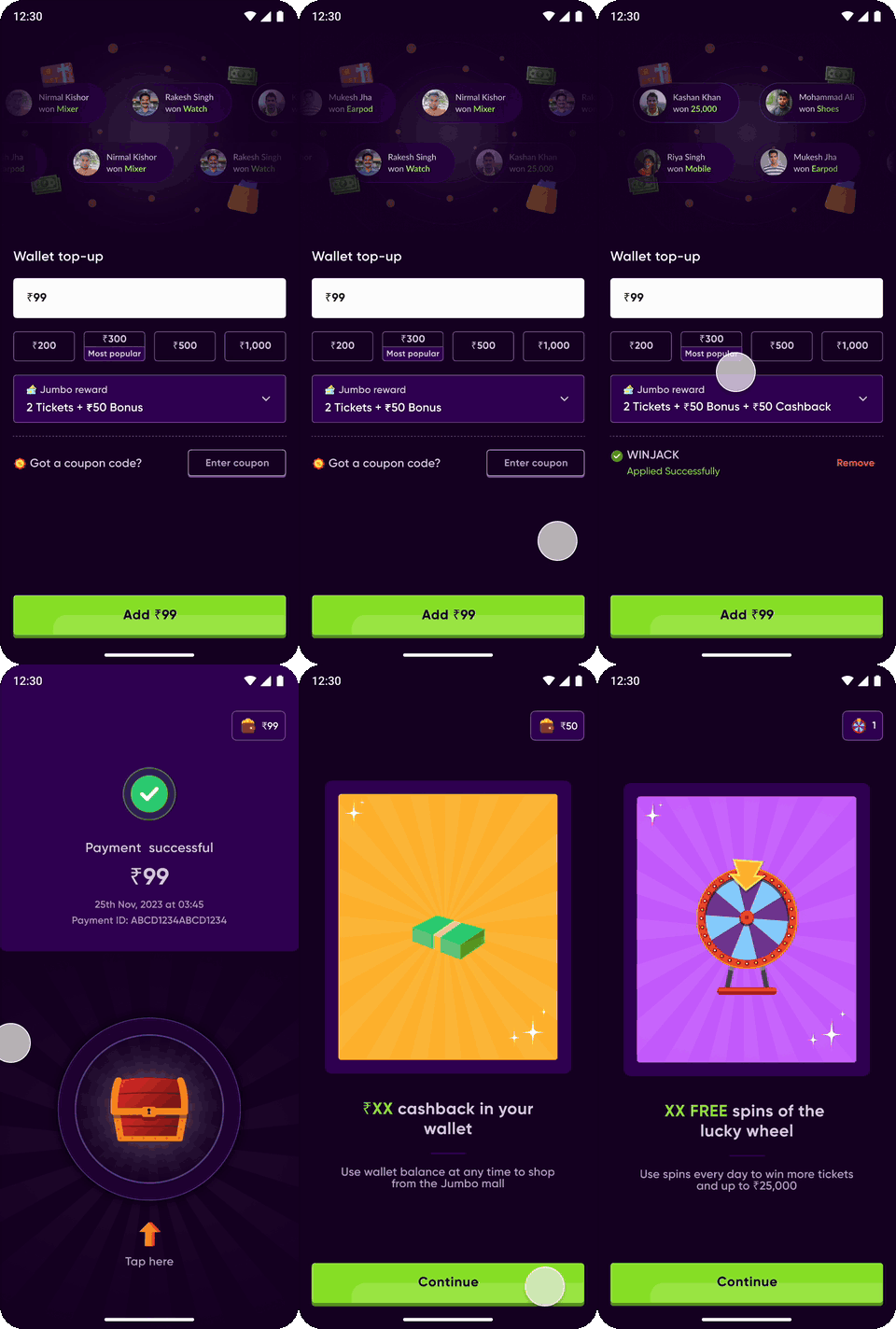
Wallet Top-up
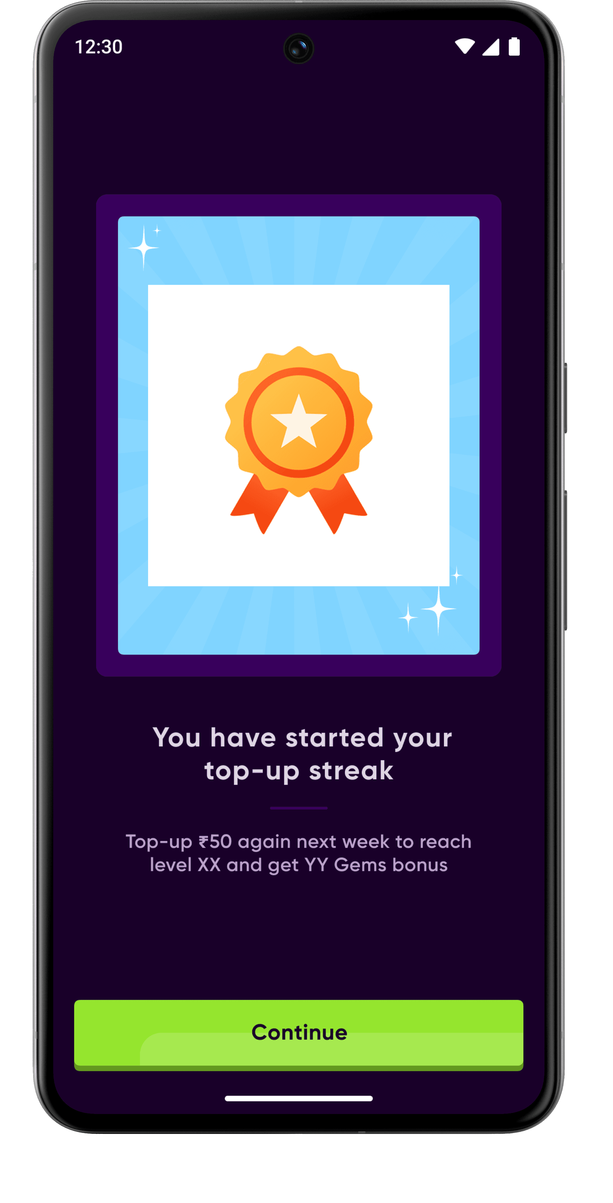
I redesigned the top-up experience around value + trust.
Users can see recent winners, choose from suggested top-up amounts, understand the rewards they’ll receive, and apply a coupon. After payment, the rewards are revealed one by one to make the moment feel earned.
Validates
“Before I put money in, I want to know what I’m getting out of it.”
By doing this it make the first top-up feel less like a payment and more like a clear exchange of value.
Ticket Picking
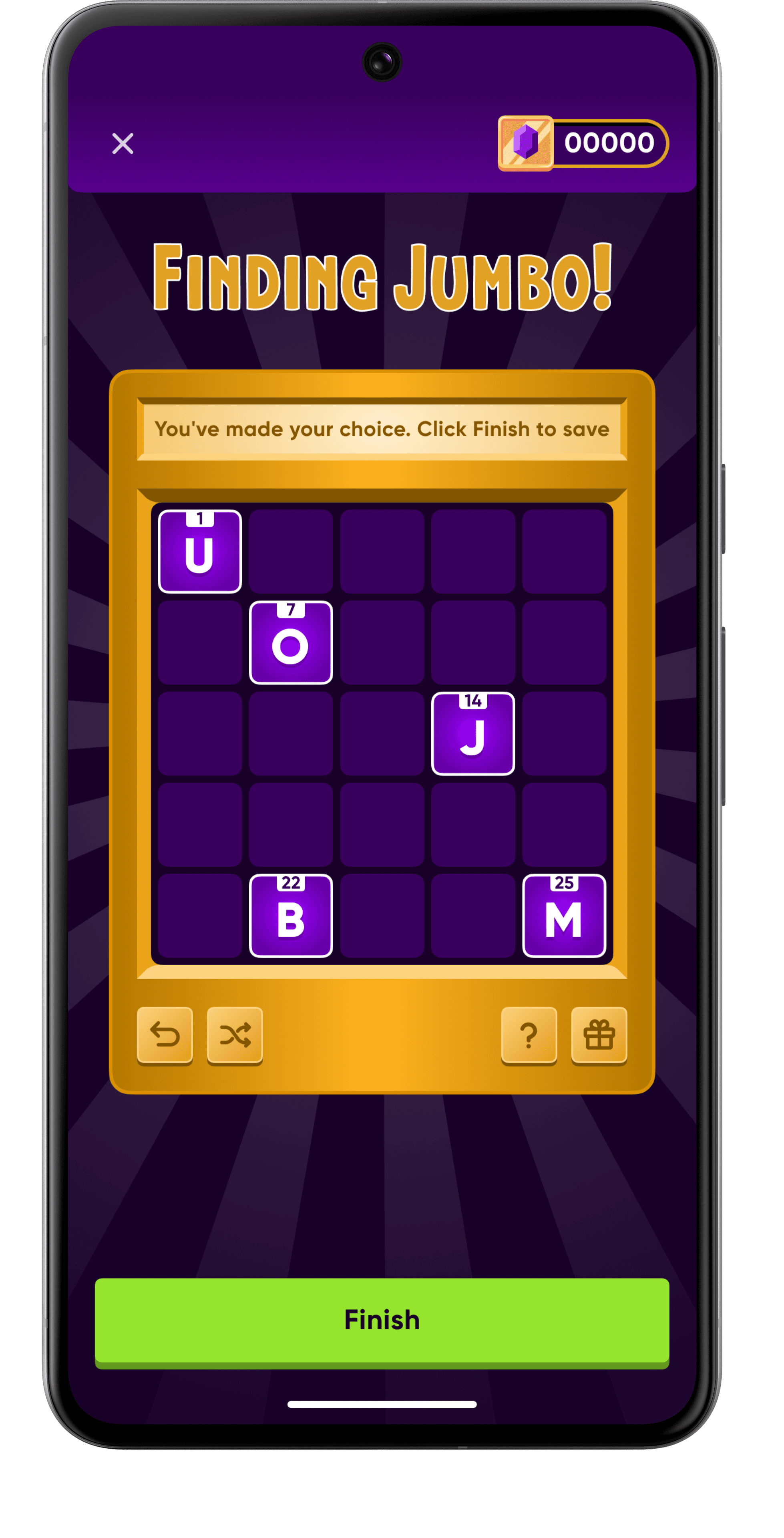
After login and top-up, I introduced a guided first-play experience to explain how Jumbo’s first game works (only for new users) - how to pick numbers, use a ticket, buy additional tickets, and when the Saturday YouTube draw happens.
Validates
“Mujhe samajh nahi aa raha game kaise khelna hai.”
The user interactions showed that uncertainty could stop someone before they even tried the game. So instead of expecting users to figure it out themselves, I turned the first play into a guided journey.

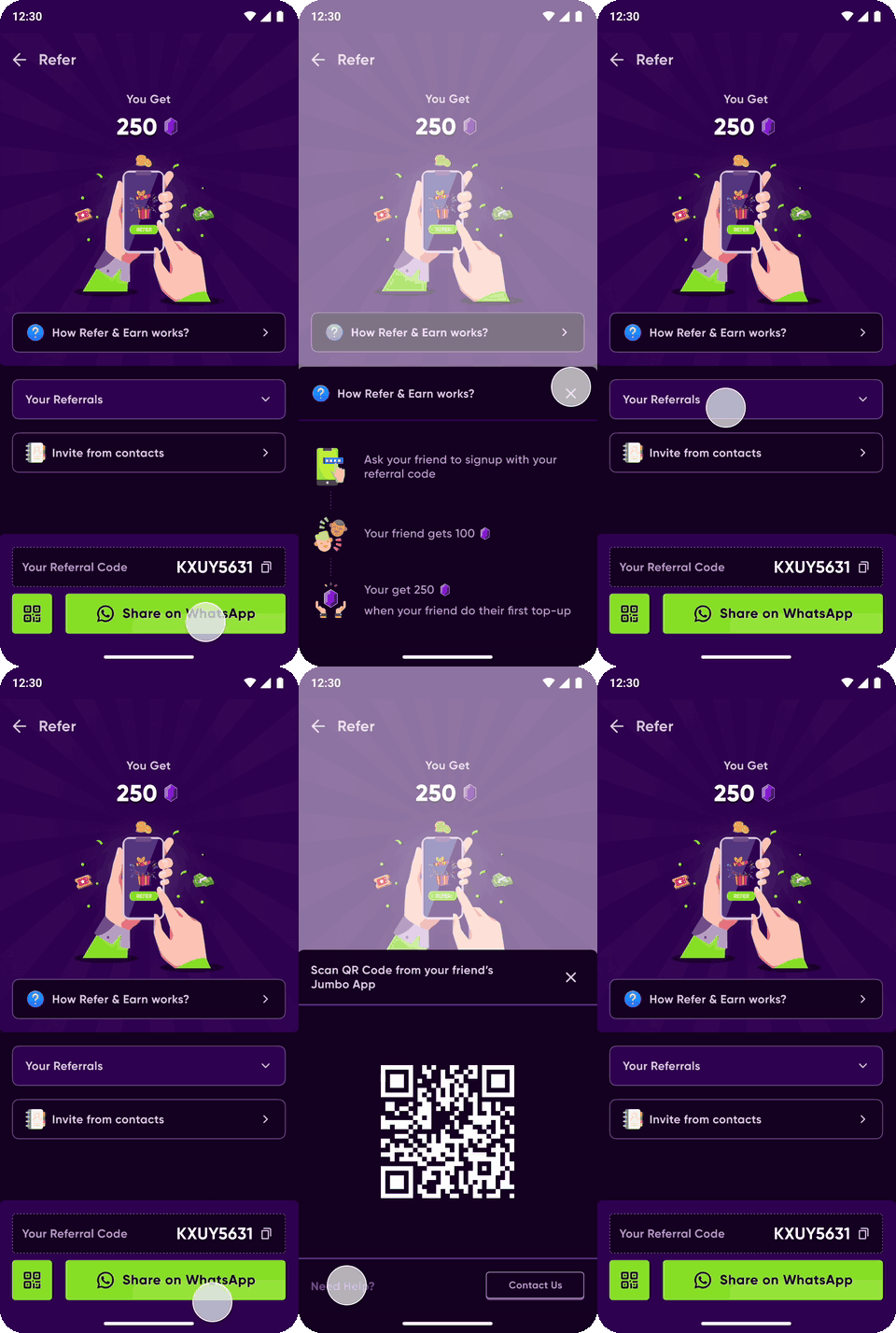
Refer & Earn
I simplified the referral experience around one clear question: “Why should I refer Jumbo?”
Removed unnecessary clutter and focused on the benefits, earning potential, and how it works.
Made the referral steps easy to understand and act on.
Gave Refer & Earn its own bottom-nav entry because referrals were a key acquisition channel for the early product.
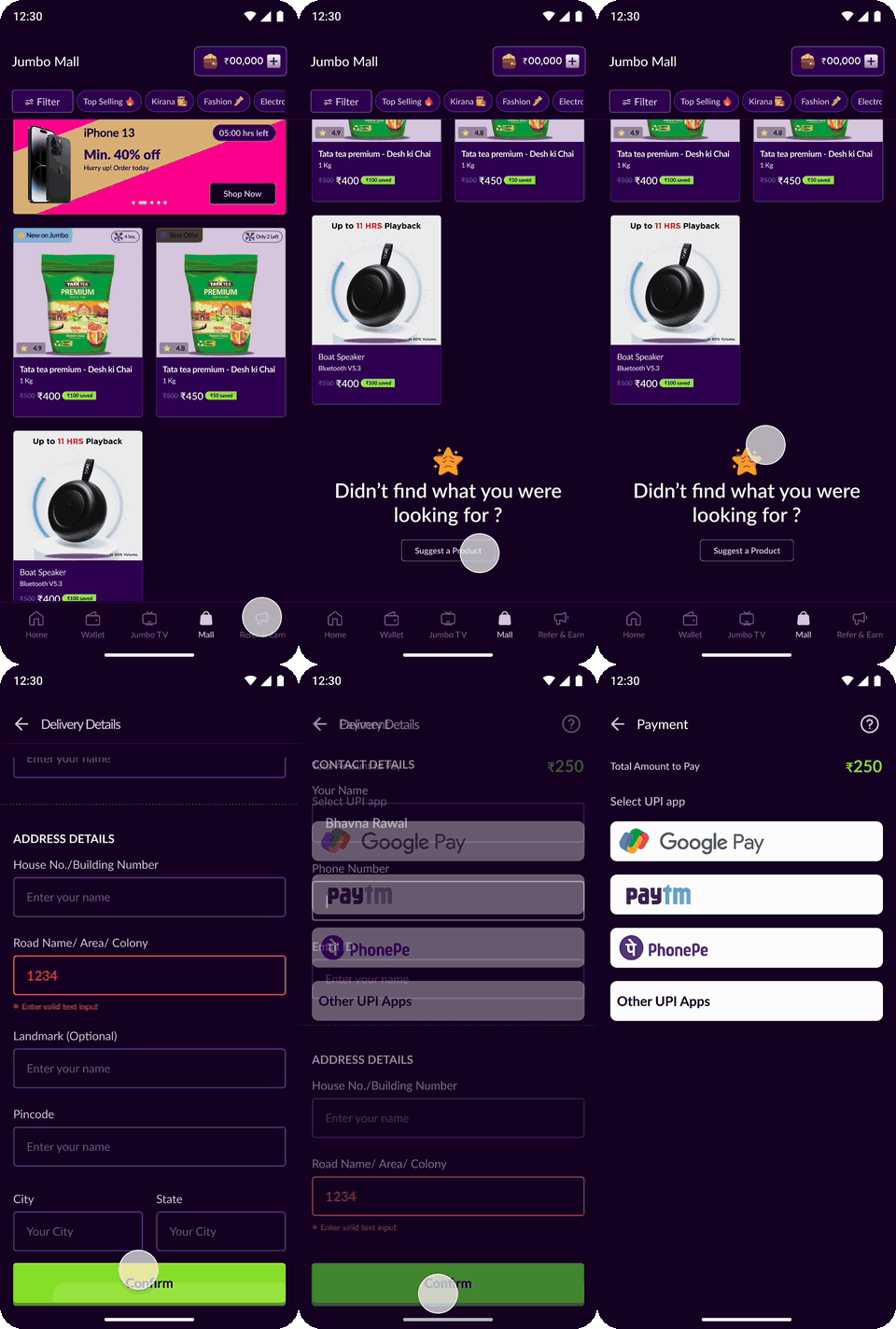
Jumbo Mall
Turned the Mall into a familiar shopping experience with a dedicated entry point, filters, product details, checkout, and order tracking.
I also added a product suggestion option to learn what users actually want to shop for.
The Mall makes the “use your wallet even if you lose” proposition tangible, while familiar shopping patterns reduce the learning curve.
HomePage/ Spin wheel
I shifted the home screen from being shopping-first to Jumbo-first.
Jumbo Stories: Used a familiar Instagram/WhatsApp-style format to explain features like Number Picking, Refer & Earn, and Jumbo League without adding heavy instructions.
Winner stories & reviews: Added real winner experiences to provide social proof and help new users understand that Jumbo is a functioning, trusted product.
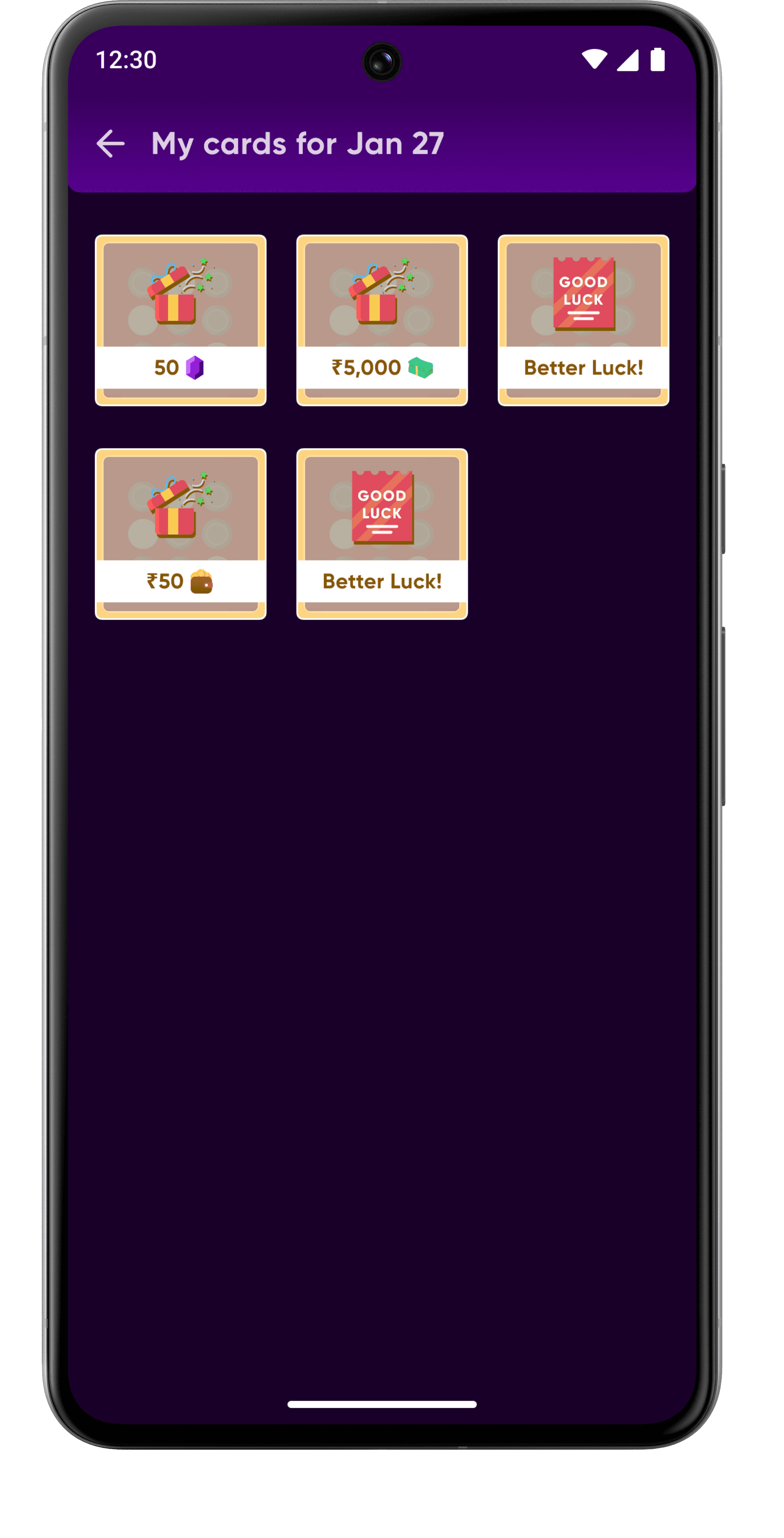
Daily Spin: Introduced a free daily spin to give users a simple reason to return and discover more of the app.
Clearer hierarchy: Game discovery, product education and trust now come before the Mall.








The outcome
From a skeleton to 100K+
In roughly six months, the product moved from a small founding team and a concept to a live mobile experience with multiple games, rewards, wallet, shopping, KYC and more than 100K users/downloads.
100k+
users / downloads
40%
churn reduction after onboarding redesign
Reflections & Learnings
0→1 taught me that speed is a design skill
🚀
01
Discover first
When the product is new, your biggest job is finding out what matters.
02
Trust is UX
When money is involved, reassurance cannot live only in marketing.
03
Test over polish
A fast learning loop can be more valuable than a perfect first version
04
Systems can emerge
Our design language became stronger because repeated product decisions taught us what to standardise
Jumbo Play · 0 → 1
Not bad for a product that started with a concept, a tiny team and a blank Figma file 😉